
Design System Page
All components and tokens are rendered on a dedicated Figma page — your single source of visual truth.
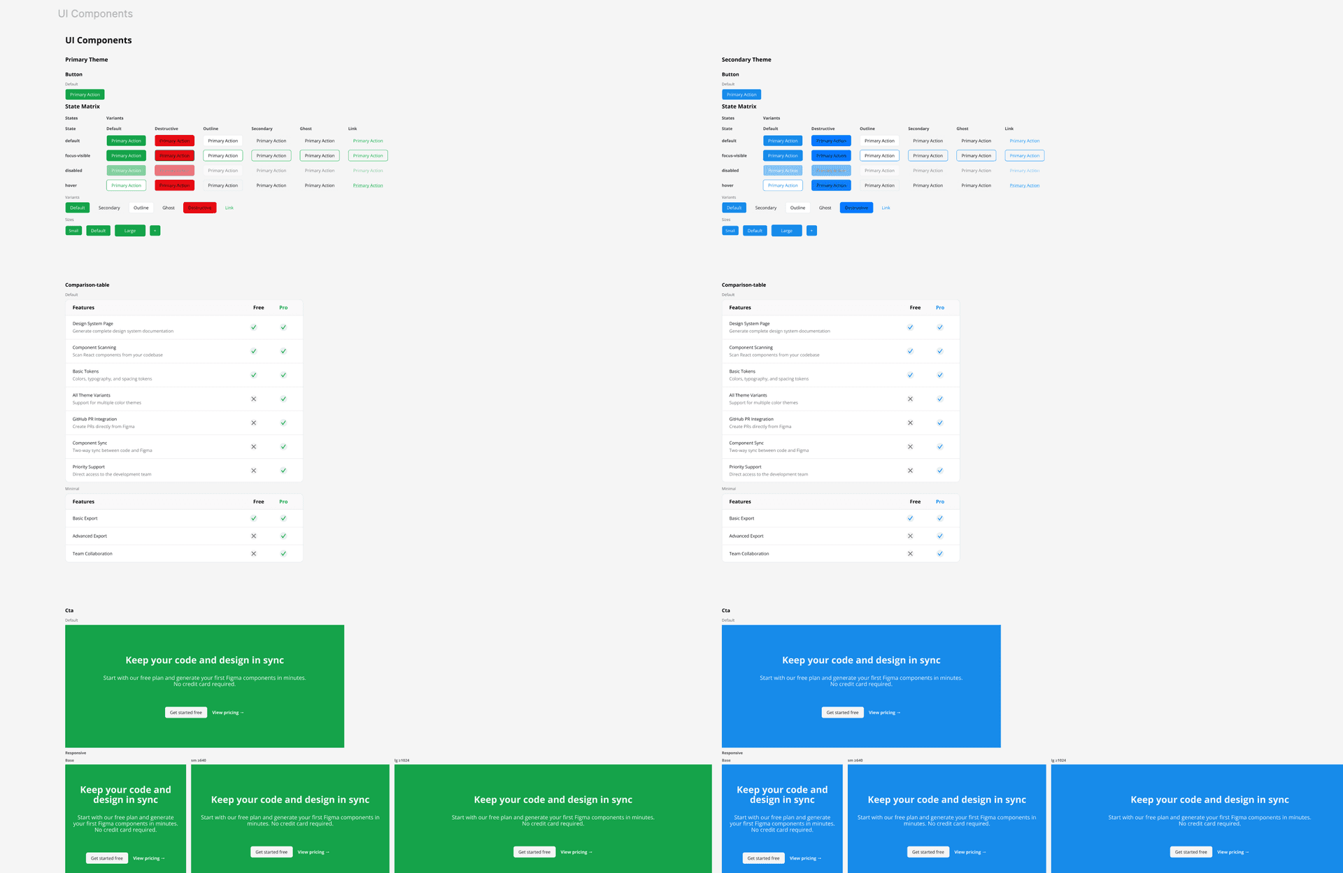
How it works
The plugin generates a Figma page containing the token tables, themed component columns, story variants, and grouped preview sections. Instead of one flat dump, the page mirrors your Storybook title hierarchy: a 'Custom Tokens' section first, then component sections (a 'Components' section plus any consumer feature groups like Marketing or Perps), with folders nested by Storybook path — so designers navigate the system the same way they navigate Storybook. A preflight panel lets you pick which themes, layout, and components to build before anything is drawn.
Usage
- 1
Click 'Generate Design System Page' in the plugin panel — a preflight panel opens first (see 'Preflight: themes, layout & selection').
- 2
A page named 'Design System' is created (or updated) in your Figma file.
- 3
Token tables ('Custom Tokens') are rendered first, followed by the component catalogue sections.
- 4
Multiple themes are arranged as Lanes (each theme its own column) or side by side in Compare mode, depending on your preflight choice.
- 5
Each component block contains its story variants, with responsive and state previews nested under the relevant story.
- 6
Re-running the command updates only changed components — unchanged frames are preserved, so annotations, comments, and manual positioning survive re-runs.